Creating an Interactive Planner using R Shiny
I am excited to share with you the Gaviota Region Interactive Planner, an R Shiny app I have been recently working on, designed to visualize and evaluate spatial environmental data in the Santa Barbara County region. This app is a part of a project for the Master of Environmental Science and Management program at the Bren School, University of California Santa Barbara, and is being developed for The Nature Conservancy to aid in their efforts to preserve natural resources in the Gaviota region.
Here you have the link to the app:
https://shinyapps.bren.ucsb.edu/TNC-Gaviota_Region_Interactive_Planner
And here the one to the GitHub repository:
https://github.com/pcarbomestre/TNC-Gaviota_Region_Interactive_Planner
App contents
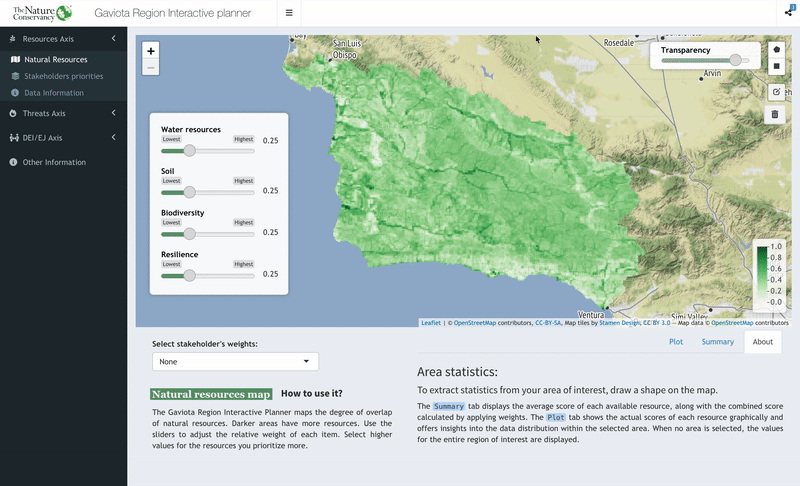
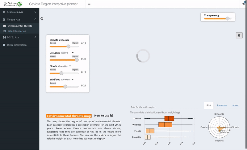
The application is designed to visualize and analyze spatial environmental data, with a focus on three primary axes: Natural Resources, Environmental Threats, and DEJ/EJ issues. Each axis contains multiple layers of data that define our region, highlighting areas of interest based on different metrics. Users can adjust the weight of each layer and view an aggregated representation of the data. Additionally, the app provides the ability to extract statistics for a specific area of interest selected by the user.
The natural resources axis includes water resources, soil, biodiversity, and resilience. The environmental threats axis includes droughts, flooding, wildfires, and climate exposure. The DEJ/EJ issues axis includes pollution, isolation from nature, and demographics. Additionally, the natural resources axis has an additional map that allows comparing stakeholder groups’ resource priorities.
The data used was collected from several open-source databases, including Data Basin and Santa Barbara County Conservation Blueprint Atlas, and were developed by TNC, the Conservation Biology Institute (CBI), the Federal Emergency Management Agency (FEMA), California Department of Water Resources (DWR), and the CalEnviroScreen 3.0. Spatial data was processed using the Environmental Evaluation Modeling System (EEMS), allowing us to integrate metrics of different types into single spatial layers.
Interesting components
Among all the app components, I am particularly enthusiastic about two features.
Raster Calculations
Originally, the app was designed to work with spatial vectors, but the operations for weighting and aggregated value calculations were computationally inefficient. To speed up the process, I transformed the original data in .shp format into raster, specifically using star objects. The stars package offers the advantages of typical raster formats while containing an attribute table on top of the raster bands. Raster calculations are much faster since they’re based on matrix algebra. As a result, I was able to significantly reduce buffering times when updating the data to be displayed on the map.
Map Data Extraction
With the leaflet drawing capabilities, I implemented a code that extracts the coordinates of the drawn polygon and transform it into a spatial object. With that spatial object, the app performs a clip on the displayed map and extract the data inside our area of interest, being able then to summarize it and display it in many ways.
Room for improvement
The core components of the app have been implemented, and I am currently undergoing a review and testing process. Additional features, such as a product tour to guide users through the app’s functions and provide more in-depth information about the represented data, will be added. The final version is expected to be released in May.
I welcome any contributions to this repository and encourage everyone to explore the app and provide feedback for future updates and improvements. If you have any questions about this Repo, find any bugs, or have any recommendations for improvements, please don’t hesitate to contact me.