Vessel detection using Synthetic Aperture Radar: Potential for improved fisheries management
Code
# Import packagesimport pandas as pdimport geopandas as gpdimport matplotlib.pyplot as pltimport matplotlib.colors as mcolorsfrom matplotlib.colors import ListedColormapimport matplotlib.dates as mdatesimport matplotlib.cm as cmimport numpy as npimport osimport datetimeimport foliumimport ipywidgetsimport plotly.express as pximport plotly.graph_objs as gofrom folium import plugins, FeatureGroupfrom folium.plugins import HeatMap, TimeSliderChoroplethfrom shapely.geometry import Polygonfrom branca.colormap import linearfrom datetime import datetime, timedeltaimport plotly.graph_objs as gofrom sklearn import preprocessing
In this post, we highlight the practical application of the vessel detection model described in the previous post, using Sentinel 1 SAR images from the ESA Copernicus program. We illustrate how the derived data can be used to monitor fishing activities, while also demonstrating the contributions of these technologies to fisheries management.
Transforming model outputs
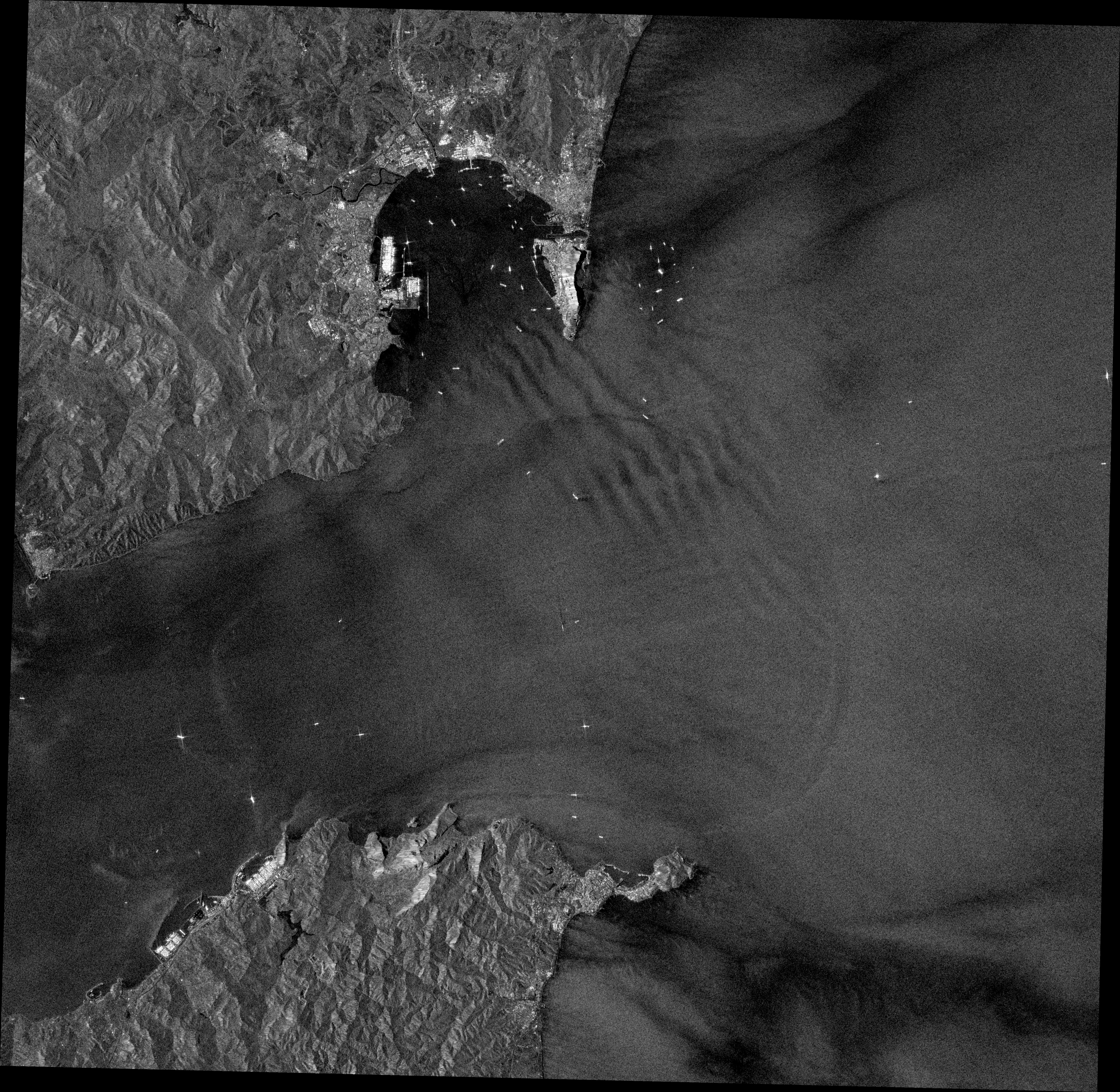
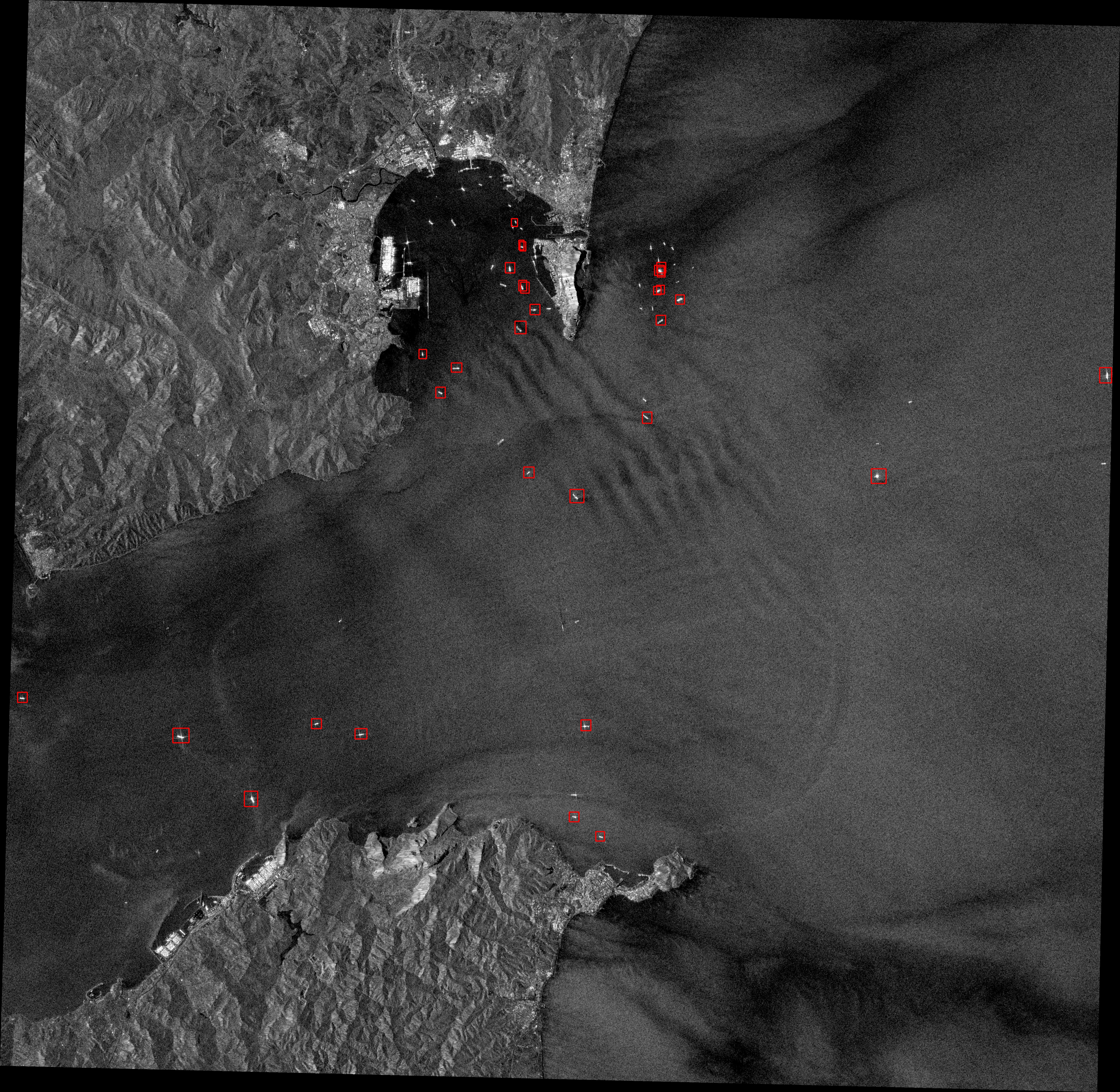
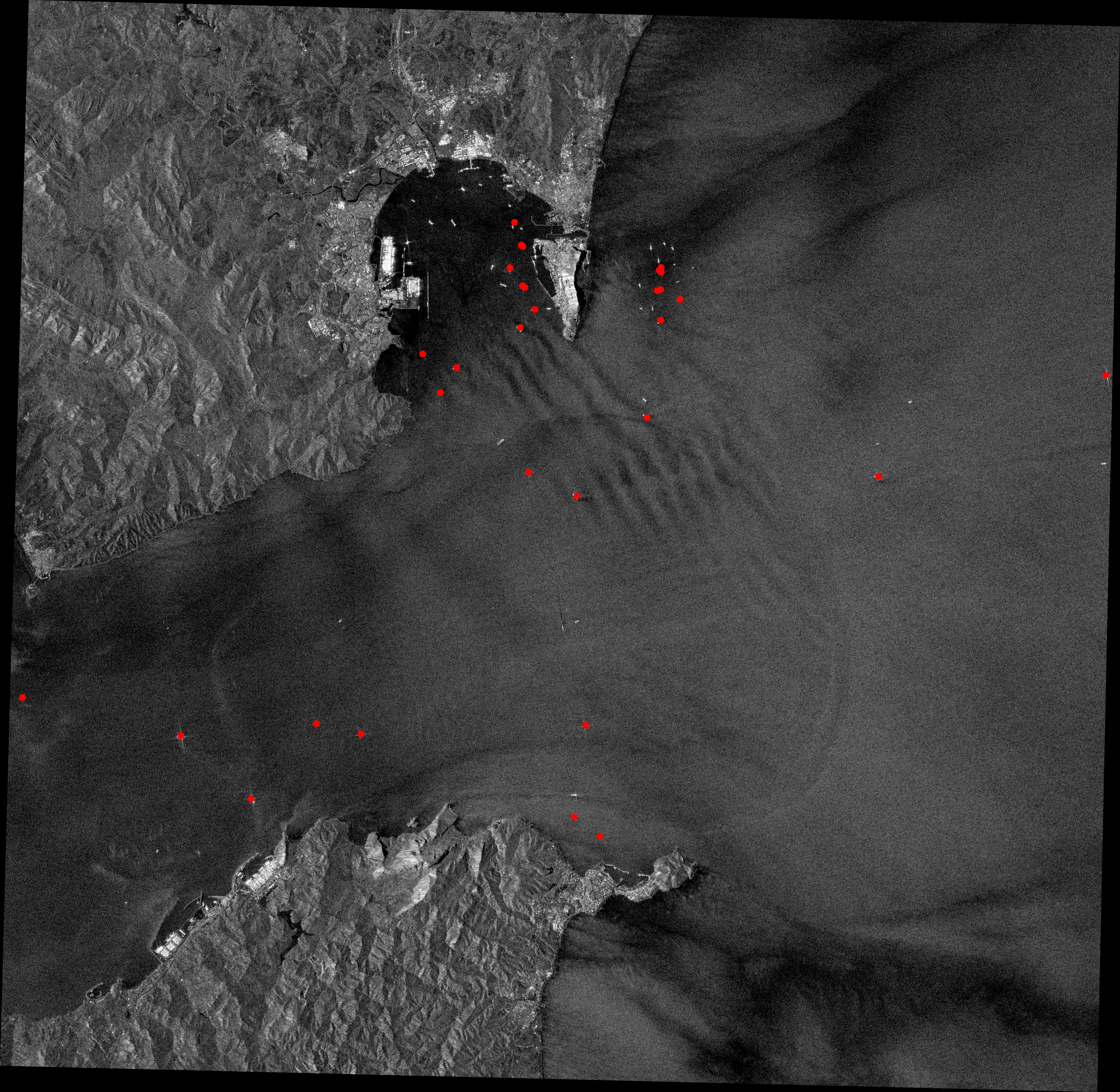
A total of 348 images, amounting to 93GB of data, were extracted from the Google Earth Engine (GEE) and processed to evaluate a period from January 2018 to December 2022, covering 1024011 km2. The detection model was applied after reprojecting the images to a CRS of interest. The resulting bounding boxes from the model were converted into coordinate points, representing the precise locations of the detected vessels. The images below provide visual examples of this process. Starting with the raw images, the vessels are detected using the model, and their bounding boxes are extracted. By calculating the centroids of these bounding boxes, we obtain the accurate coordinates of the vessels. This transformation of the model outputs into meaningful data has great potential for various applications, including fisheries management.
You can find the code necessary for image access, detection processing, and transforming the model outputs into meaningfull data in the following link:
The specific marine region under examination is the Corcovado Gulf, located in southern Chile. We chose this area as a case study based on three criteria. Firstly, the Corcovado Gulf is known for active fishing activities, including artisanal and industrial fisheries. The commercial fishing of hake and spider crab is carried out using large fishing vessels with metallic superstructures and hulls, making their signature on SAR images easily distinguishable compared to smaller or wooden boats. Secondly, considering the limited maritime traffic in the area, except for the passenger lanes connecting Quellón to Guaitecas and Port Raul Marin Balmaceda, we can reasonably assume that the model’s detections are primarily associated with fishing activity, eliminating the need for an additional classification model to differentiate between fishing and non-fishing vessels—which development was beyond the scope of this project. This allows us to extrapolate the detections to fishing vessels and qualitatively showcase the application of the model through a case study focused on fisheries. Lastly, the Corcovado region benefits from wide Sentinel 1 coverage, providing multiple complete and partial images of the study area on a monthly basis.
The area of interest (AOI) encompasses 6615.83 km2 of sea and coastline at the Corcovado Gulf’s entrance. The area is situated between two administrative fishing regions, the X Region of Los Lagos and the XI Region of Aysén, as designated by the Chilean National Service for Fishing and Aquaculture. It also includes a 1019 km2 protected area, the Tictoc-Golfo Corcovado Marine Park, established in 2022 and located northeast of our AOI.
Most of the fishing efforts in the AOI are directed towards nine benthic species, including clams, mussels, sea urchins, seaweeds, and crabs from the genus Cancer (Molinet et al. 2011). This activity is primarily carried out by boats ranging from 7 to 15 meters in length, with most of them exceeding the resolution requirements for their detection. However, the area also involves the fisheries of the southern hake (Merluccius australis), and southern king crab (Lithodes santolla), both from artisanal fishing boats with lengths up to 18 m (Molinet et al. 2020)— above SAR’s resolution—, and industrial fishing vessels (Kitts et al. 2020; Molinet et al. 2019). These vessels, and the fishing carriers assisting artisanal vessels in transhipping operations, are the potential targets of the detection model.
Vessel detections
Code
# Read the shapefilecoastline_path ='../shapefiles/corcovado_coastline/corcovado_coastline.shp'vessels_path ='../shapefiles/baseM/combined_baseM/combined_baseM.shp'aoi_path ='../regions_of_interest/corcovadogulf.geojson'coastline = gpd.read_file(coastline_path)vessels = gpd.read_file(vessels_path)aoi = gpd.read_file(aoi_path)# Set the CRScoastline.crs ='EPSG:4326'vessels.crs ='EPSG:4326'aoi.crs ='EPSG:4326'
Each vessel detected was assigned its detection score from the model and recorded with the corresponding date and time of the associated SAR image. Detections with scores below 0.6 were removed from the dataset to exclude potential false positives.
Code
# Convert 'date' column to datetime typevessels['date'] = pd.to_datetime(vessels['date'])# Extract the year and add it as a new columnvessels['year'] = vessels['date'].dt.year# Filter by score valuefiltered_vessels = vessels[vessels['score'] >0.6]# Create a Folium map centered on the centroid of the vessels GeoDataFramecenter_lat = aoi.centroid.y.mean()center_lon = aoi.centroid.x.mean()map= folium.Map(location=[center_lat, center_lon], zoom_start=9,tiles=None)# Add ESRI Ocean Base mapesri_ocean = folium.TileLayer( tiles='https://server.arcgisonline.com/ArcGIS/rest/services/Ocean/World_Ocean_Base/MapServer/tile/{z}/{y}/{x}', attr='Esri', name='Esri Ocean', overlay=False, control=True)esri_ocean.add_to(map)# Create the coastline feature groupcoastline_feature_group = folium.FeatureGroup(name='Coastline')# Style function for coastlinedef coastline_style(feature):return {'fillColor': '#808080', 'color': '#FFFFFF', 'weight': 0.5}# Iterate over the rows of the GeoDataFrame representing the coastline and add the polygon to the mapfor index, row in coastline.iterrows(): folium.GeoJson(row['geometry'], style_function=coastline_style).add_to(coastline_feature_group)# Add the coastline feature group to the mapmap.add_child(coastline_feature_group)# Style function for AOIdef aoi_style(feature):return {'fillOpacity': 0, 'color': '#000000', 'weight': 0.5, 'dashArray': '5, 5'}# Add AOI polygonsaoi_feature_group = folium.FeatureGroup(name='Area of Interest')for index, row in aoi.iterrows(): folium.GeoJson(row['geometry'], style_function=aoi_style).add_to(aoi_feature_group)map.add_child(aoi_feature_group)# Sort the unique yearsunique_years = np.sort(filtered_vessels['year'].unique())# Create a colormap for the different yearscolors = cm.Reds(np.linspace(0.5, 1, len(unique_years)))# Create a feature group for each yearfor year, color inzip(unique_years, colors): year_vessels = filtered_vessels[filtered_vessels['year'] == year] year_feature_group = folium.FeatureGroup(name=str(year))# Convert RGB color to hex color = cm.colors.rgb2hex(color)# Iterate over the rows of the GeoDataFrame and add markers for each pointfor index, row in year_vessels.iterrows(): lat, lon = row['geometry'].y, row['geometry'].x folium.CircleMarker(location=[lat, lon], radius=2, color='transparent', fill=True, fill_color=color, fill_opacity=0.6, popup=f"Year: {year}").add_to(year_feature_group)# Add the year feature group to the mapmap.add_child(year_feature_group)# Add layer control to the map (this will add the layer selection control to the map)map.add_child(folium.LayerControl())# Display the mapmap
Make this Notebook Trusted to load map: File -> Trust Notebook
Additionally, objects erroneously detected near the shoreline were excluded by clipping them out of a coast shapefile layer obtained from earthworks.stanford.edu. Furthermore, an exclusion buffer of 2km from the coastline was applied to include only vessels operating in open waters, where the fishing activities of interest concentrate.
Code
# Apply buffer to geometriesbuffer_distance =0.02# Buffer distance in (degrees) the unit of the shapefile's coordinate reference systembuffered_coastline = coastline.buffer(buffer_distance)buffered_coastline = gpd.GeoDataFrame(geometry=buffered_coastline)# Clip the buffered coastline using the aoiclipped_coastline = gpd.overlay(buffered_coastline, aoi, how='intersection')# Perform the spatial operation to select non-intersecting pointsnon_intersecting_vessels = filtered_vessels[~filtered_vessels.intersects(buffered_coastline.geometry.iloc[0])]# Create a Folium map centered on the centroid of the vessels GeoDataFramecenter_lat = aoi.centroid.y.mean()center_lon = aoi.centroid.x.mean()map= folium.Map(location=[center_lat, center_lon], zoom_start=9,tiles=None)# Add ESRI Ocean Base mapesri_ocean = folium.TileLayer( tiles='https://server.arcgisonline.com/ArcGIS/rest/services/Ocean/World_Ocean_Base/MapServer/tile/{z}/{y}/{x}', attr='Esri', name='Esri Ocean', overlay=False, control=True)esri_ocean.add_to(map)# Create the coastline feature groupcoastline_feature_group = folium.FeatureGroup(name='Coastline')# Style function for coastlinedef coastline_style(feature):return {'fillColor': '#808080', 'color': '#FFFFFF', 'weight': 0.5}# Iterate over the rows of the GeoDataFrame representing the coastline and add the polygon to the mapfor index, row in coastline.iterrows(): folium.GeoJson(row['geometry'], style_function=coastline_style).add_to(coastline_feature_group)# Add the coastline feature group to the mapmap.add_child(coastline_feature_group)## Add buffer zonebuffer_feature_group = folium.FeatureGroup(name='Buffer')def buffer_style(feature):return {'fillColor': '#808080', 'color': '#FFFFFF', 'weight': 0.5}for index, row in clipped_coastline.iterrows(): folium.GeoJson(row['geometry'], style_function=buffer_style).add_to(buffer_feature_group)map.add_child(buffer_feature_group)# Style function for AOIdef aoi_style(feature):return {'fillOpacity': 0, 'color': '#000000', 'weight': 0.5, 'dashArray': '5, 5'}# Add AOI polygonsaoi_feature_group = folium.FeatureGroup(name='Area of Interest')for index, row in aoi.iterrows(): folium.GeoJson(row['geometry'], style_function=aoi_style).add_to(aoi_feature_group)map.add_child(aoi_feature_group)## Sort the unique yearsunique_years = np.sort(non_intersecting_vessels['year'].unique())# Create a colormap for the different yearscolors = cm.Reds(np.linspace(0.5, 1, len(unique_years)))# Create a feature group for each yearfor year, color inzip(unique_years, colors): year_vessels = non_intersecting_vessels[non_intersecting_vessels['year'] == year] year_feature_group = folium.FeatureGroup(name=str(year))# Convert RGB color to hex color = cm.colors.rgb2hex(color)# Iterate over the rows of the GeoDataFrame and add markers for each pointfor index, row in year_vessels.iterrows(): lat, lon = row['geometry'].y, row['geometry'].x folium.CircleMarker(location=[lat, lon], radius=2, color='transparent', fill=True, fill_color=color, fill_opacity=0.6, popup=f"Year: {year}").add_to(year_feature_group)# Add the year feature group to the mapmap.add_child(year_feature_group)# Add layer control to the map (this will add the layer selection control to the map)map.add_child(folium.LayerControl())# Display the mapmap
Make this Notebook Trusted to load map: File -> Trust Notebook
After that preprocessing, a total of 365 vessels were identified and selected for the analysis, with most detections occurring during the initial years of the specified timeframe
Spatial information
To assess the spatial distribution of the vessels, we generated a static heatmap that combines observations from all five years. Additionally, we created a dynamic heatmap that displays the presence of vessels on a yearly basis.
Heat maps
Code
# Create a Folium map centered on the centroid of the vessels GeoDataFramecenter_lat = aoi.centroid.ycenter_lon = aoi.centroid.xm = folium.Map(location=[center_lat, center_lon], zoom_start=9)# Create a new DataFrame with only latitude and longitude columnsdf_vessels = pd.DataFrame({'Latitude': non_intersecting_vessels.geometry.y,'Longitude': non_intersecting_vessels.geometry.x,'Date': non_intersecting_vessels['date']})# Ensure you're handing it floatsdf_vessels['Latitude'] = df_vessels['Latitude'].astype(float)df_vessels['Longitude'] = df_vessels['Longitude'].astype(float)# Filter the DF for rows, then columns, then remove NaNsdf_vessels = df_vessels[['Latitude', 'Longitude']]df_vessels = df_vessels.dropna(axis=0, subset=['Latitude','Longitude'])# List comprehension to make out list of listsdf_vessels = [[row['Latitude'],row['Longitude']] for index, row in df_vessels.iterrows()]# Plot it on the mapHeatMap(df_vessels, radius =15).add_to(m)tile = folium.TileLayer( tiles='https://server.arcgisonline.com/ArcGIS/rest/services/Ocean/World_Ocean_Base/MapServer/tile/{z}/{y}/{x}', attr='Esri', name='Esri Satellite', overlay=False, control=True).add_to(m)# Display the mapm
Make this Notebook Trusted to load map: File -> Trust Notebook
Code
# Create a new DataFrame with only latitude and longitude columnsdf_vessels_t = pd.DataFrame({'Latitude': non_intersecting_vessels.geometry.y,'Longitude': non_intersecting_vessels.geometry.x,'Date': non_intersecting_vessels['date']})df_vessels_t['year'] = pd.DatetimeIndex(df_vessels_t['Date']).yearindex_list = df_vessels_t['year'].astype(str)index_list = index_list.unique().tolist()weight_list = []df_vessels_t['count'] =1for x in df_vessels_t['year'].sort_values().unique(): weight_list.append(df_vessels_t.loc[df_vessels_t['year'] == x, ['Latitude', 'Longitude','count']].groupby(['Latitude', 'Longitude']) .sum().reset_index().values.tolist())from folium.plugins.heat_map_withtime import HeatMapWithTime# Create a Folium map centered on the centroid of the vessels GeoDataFramecenter_lat = aoi.centroid.ycenter_lon = aoi.centroid.xm = folium.Map(location=[center_lat, center_lon], control_scale=True, zoom_start=9)HeatMapWithTime(weight_list, radius =30, index= index_list, gradient={0.1: 'blue',0.25:"green",0.5:'yellow',0.75:'orange',1:'red'}, auto_play=True, min_opacity=0.1, max_opacity=0.8,blur=1, use_local_extrema =True, position ="topright").add_to(m)tile = folium.TileLayer( tiles='https://server.arcgisonline.com/ArcGIS/rest/services/Ocean/World_Ocean_Base/MapServer/tile/{z}/{y}/{x}', attr='Esri', name='Esri Satellite', overlay=False, control=True).add_to(m)m
Make this Notebook Trusted to load map: File -> Trust Notebook
Attending to the previous maps, we can see that all fishing-related activities, including navigation, fishing, and transhipping, are predominantly concentrated in the southern region of our AOI, particularly in the adjacent waters of Guaitecas. Additionally, there is a noticeable absence of any activity on the east-northeast side, precisely where the Tictoc-Golfo Corcovado Marine Park is located.
Density maps
To gain insights into the number of vessels associated with a particular region during each time period, we constructed a density map using a 5x5km grid. This map allows us to visualize the concentration of vessels within specific areas for the entire period and also visualize the changes over time.
Code
# Read the GeoJSON file containing your point datapoints = non_intersecting_vessels# Define the grid cell sizecell_size =0.05# Adjust this value according to your requirements# Determine the extent of the point dataxmin, ymin, xmax, ymax = aoi.total_bounds# Create a list to store grid cellsgrid_cells = []# Generate the grid cellsx_left = xminwhile x_left < xmax: x_right = x_left + cell_size y_bottom = yminwhile y_bottom < ymax: y_top = y_bottom + cell_size polygon = Polygon([(x_left, y_bottom), (x_right, y_bottom), (x_right, y_top), (x_left, y_top)]) grid_cells.append(polygon) y_bottom += cell_size x_left += cell_size# Create a GeoDataFrame for the grid cellsgrid = gpd.GeoDataFrame({'geometry': grid_cells}, crs='EPSG:4326')# Perform the spatial joinjoin = gpd.sjoin(grid, points, op='contains')# Count the number of points in each cellpoint_counts = join.groupby(join.index).size()# Add the point counts to the gridgrid['point_counts'] = point_countsgrid['id'] = grid.index# Filter out grid cells with NaN valuesfiltered_grid = grid.dropna(subset=['point_counts'])# Sum all the values in the 'point_counts' columntotal_sum = filtered_grid['point_counts'].sum()# Create a Folium map centered on the centroid of the vessels GeoDataFramecenter_lat = aoi.centroid.ycenter_lon = aoi.centroid.xm = folium.Map(location=[center_lat, center_lon], zoom_start=9)# Create a Folium Choropleth layer based on the 'point_counts' columnfolium.Choropleth( filtered_grid, name='Grid with Counts', data=filtered_grid, columns=['id', 'point_counts'], key_on='feature.id', fill_color='YlGnBu', fill_opacity=0.6, line_opacity=0, nan_fill_opacity=0, # Set opacity to 0 for cells with point_counts equal to 0 legend_name='Vessel Counts', highlight=True).add_to(m)# Add the grid cells as a GeoJson layer to the mapfolium.GeoJson(filtered_grid, name='Grid with Counts', style_function=lambda feature: {'fillColor': 'transparent','color': 'transparent', }, highlight_function=lambda feature: {'fillColor': 'white','color': 'black','weight': 0.5,'fillOpacity': 0.3,'Opacity': 0.3 }, tooltip=folium.features.GeoJsonTooltip(fields=['point_counts'], aliases=['Vessel Counts'], labels=True, sticky=True) ).add_to(m)tile = folium.TileLayer( tiles='https://server.arcgisonline.com/ArcGIS/rest/services/Ocean/World_Ocean_Base/MapServer/tile/{z}/{y}/{x}', attr='Esri', name='Esri Satellite', overlay=False, control=True).add_to(m)# Display the mapm
Make this Notebook Trusted to load map: File -> Trust Notebook
Code
# Read the GeoJSON file containing your point datapoints = non_intersecting_vessels# Convert the date column to datetime formatpoints['date'] = pd.to_datetime(points['date'])# Define the grid cell sizecell_size =0.05# Adjust this value according to your requirements# Determine the extent of the point dataxmin, ymin, xmax, ymax = aoi.total_bounds# Create a list to store grid cellsgrid_cells = []# Generate the grid cellsx_left = xminwhile x_left < xmax: x_right = x_left + cell_size y_bottom = yminwhile y_bottom < ymax: y_top = y_bottom + cell_size polygon = Polygon([(x_left, y_bottom), (x_right, y_bottom), (x_right, y_top), (x_left, y_top)]) grid_cells.append(polygon) y_bottom += cell_size x_left += cell_size# Create a GeoDataFrame for the grid cellsgrid = gpd.GeoDataFrame({'geometry': grid_cells}, crs='EPSG:4326')# Perform the spatial joinjoin = gpd.sjoin(grid, points, op='contains')# Extract month and year from the date columnjoin['year'] = join['date'].dt.to_period('Y')# Count the number of points in each cell by month and yearpoint_counts = join.groupby([join.index, 'year']).size().reset_index(name='count')# Merge the point counts with the gridgrid = grid.merge(point_counts, how='left', left_index=True, right_on='level_0')# Fill missing values with 0grid['count'] = grid['count'].fillna(0).astype(int)# Rename columns and remove unnecessary onesgrid = grid.rename(columns={'count': 'point_counts', 'level_0': 'id'})[['geometry', 'point_counts', 'id', 'year']]# Rename columns and remove unnecessary onesgrid = grid.dropna(subset=['year'])# Define the date transformation functiondef transform_date(period): date_string =str(period) date = datetime.strptime(date_string, '%Y') next_month = date.replace(day=28) + timedelta(days=4) last_day = next_month - timedelta(days=next_month.day) last_day_string = last_day.strftime('%Y-%m-%d')return last_day_stringgrid['date'] = grid['year'].apply(lambda x: transform_date(x))# Obtain date values in terms of secondsgrid["date"] = pd.to_datetime(grid["date"]).values.astype(float)/10**9grid["date"] = grid["date"].astype(int).astype(str)# Find the maximum value in the 'point_counts' columnmax_value = grid['point_counts'].max()# Create an empty dataframe for all combinations of 'id' and 'date'all_combinations = pd.MultiIndex.from_product([grid['id'].unique(), grid['date'].unique()], names=['id', 'date'])# Create a new dataframe with all combinationsfull_grid = pd.DataFrame(index=all_combinations).reset_index()# Merge full_grid with gridgrid = pd.merge(full_grid, grid, on=['id', 'date'], how='left')# Fill missing point_counts with 0grid['point_counts'] = grid['point_counts'].fillna(0).astype(int)# map values in tot_counts to appropriate hex color valuesmin_color, max_color =min(grid["point_counts"]), max(grid["point_counts"])# Define the colormap# Define the color mapper functiondef color_mapper(count):if count ==0:returnNoneelse:return cmap(count)cmap = linear.YlGnBu_04.scale(min_color, max_color).to_step(max_value)grid["color"] = grid["point_counts"].map(color_mapper)# create a json object with all keys and values--- keys: country index string, values {'color': X , 'opacity': Y}style_dict = {}cell_values = grid["id"].unique()for idx inrange(len(cell_values)): inner_dict = {}id= cell_values[idx] rows = grid[grid["id"]==id]for _, row in rows.iterrows(): color = row["color"] opacity =0if row['point_counts'] ==0else0.6# adjust opacity here inner_dict[row["date"]] = {"color": color, "opacity": opacity } style_dict[idx] = inner_dictfeature_dict = {}grid = gpd.GeoDataFrame(grid)geometries = grid[["geometry"]]geo_geometries = gpd.GeoDataFrame(geometries)geo_geometries = geo_geometries.drop_duplicates().reset_index()# Create a Folium map centered at the mean coordinates of the gridcenter = [grid['geometry'].centroid.y.mean(), grid['geometry'].centroid.x.mean()]slider_map = folium.Map(location=center, zoom_start=9)TimeSliderChoropleth( name="Time slider", data=geo_geometries.to_json(), styledict=style_dict).add_to(slider_map)tile = folium.TileLayer( tiles='https://server.arcgisonline.com/ArcGIS/rest/services/Ocean/World_Ocean_Base/MapServer/tile/{z}/{y}/{x}', attr='Esri', name='Esri Satellite', overlay=False, control=True).add_to(slider_map)cmap.add_to(slider_map)cmap.caption ="Vessels"slider_map
Make this Notebook Trusted to load map: File -> Trust Notebook
Despite the limited scope of this analysis, some of its findings could potentially be used for describing the local fisheries. For instance, the spatial pattern detected could be attributed to the location of the primary fishing grounds, which would be situated north of Guaitecas and east of the Queitao islands in the central region of the AOI. This distribution at least highlights areas where fishing activity is not predominant and from which fishery enforcement efforts could be redirected towards higher vessel density areas.
Additionally, the absence of vessel presence within the waters inside the Marine Park is noteworthy. This observation sheds light on the rationale behind designating that specific area as protected in 2022. It is possible that the area’s lower interest and reduced conflict among stakeholders facilitated or influenced its selection for protection.
Temporal series
Regarding to the temporal distribution of the detections, the following figure illustrates the number of selected vessels per month. Consistent with the values in the following table, the graph shows an overall downward trend in the number of detected vessels over the years. However, the variations in vessel counts can be explained by the changes in SAR images availability and area covered rather than actuall changes in vessel precense.
Code
vessels_of_interest = non_intersecting_vesselsvessels_of_interest['date'] = pd.to_datetime(vessels_of_interest['date'])# Create a new column combining year and monthvessels_of_interest['year_month'] = vessels_of_interest['date'].dt.to_period('M')# Group by the combined year and month column, counting the observationsvessels_monthyear = vessels_of_interest.groupby('year_month').size().reset_index(name='vessels')# Convert year_month to Timestamp objectsvessels_monthyear['year_month'] = pd.to_datetime(vessels_monthyear['year_month'].astype(str))# Normalize 'vessels' values for color mappingmin_max_scaler = preprocessing.MinMaxScaler()vessel_norm = min_max_scaler.fit_transform(vessels_monthyear[['vessels']])# Create a blue color scale with color starting from the midpointcolorscale = [[0, 'rgb(158, 202, 225)'], [1, 'rgb(8, 48, 107)']]data = go.Bar( x=vessels_monthyear['year_month'], y=vessels_monthyear['vessels'], marker=dict( color=vessel_norm.ravel(), colorscale=colorscale ), name="", hovertemplate ='<b>Date</b>: %{x|%B %Y}'+'<br><b>Vessels</b>: %{y}<br>', hoverlabel=dict( bgcolor="white", font_size=16, font_family="Rockwell" ))layout = go.Layout( title='Detected vessels per Month', xaxis=dict(title='', tickangle=45), yaxis=dict(title='Number of vessels'), paper_bgcolor='rgba(0,0,0,0)', plot_bgcolor='rgba(0,0,0,0)',)fig = go.Figure(data=[data], layout=layout)fig.show()
To address this, and to derive meaningful conclusions from the temporal series, we can normalize the number of vessels based on the corresponding area covered in the images processed for each month.
Code
image_details_path ='/Users/polcarbo/Documents/Documents/2023/UOC/PEC/PEC4/SSDD_pcarbomestre3.0/case_study/image_details.xlsx'image_details = pd.read_excel(image_details_path)# Convert date column to datetimeimage_details['date'] = pd.to_datetime(image_details['date'])# Create new column for year_monthimage_details['year_month'] = image_details['date'].dt.to_period('M')# Group by the combined year and month column, aggregating the areaimage_details_monthyear = image_details.groupby('year_month')['area'].sum().reset_index()# Convert year_month to Timestamp objectsimage_details_monthyear['year_month'] = image_details_monthyear['year_month'].dt.to_timestamp()# Merge the two dataframes on 'year_month'combined_df = pd.merge(image_details_monthyear, vessels_monthyear, on='year_month')# Convert area from m^2 to km^2combined_df['area_km2'] = combined_df['area'] /1e6# Create new column for vessels per km^2combined_df['vessels_per_km2'] = combined_df['vessels'] / combined_df['area_km2']# Normalize vessels_per_km2combined_df['vessels_per_km2_normalized'] = (combined_df['vessels_per_km2'] - combined_df['vessels_per_km2'].min()) / (combined_df['vessels_per_km2'].max() - combined_df['vessels_per_km2'].min())# Normalize 'vessels' values for color mappingmin_max_scaler = preprocessing.MinMaxScaler()vessel_norm = min_max_scaler.fit_transform(combined_df[['vessels']])# Create a blue color scale with color starting from the midpointcolorscale = [[0, 'rgb(158, 202, 225)'], [1, 'rgb(8, 48, 107)']]data = go.Bar( x=combined_df['year_month'], y=combined_df['vessels_per_km2'], marker=dict( color=vessel_norm.ravel(), colorscale=colorscale ), name="", hovertemplate ='<b>Date</b>: %{x|%B %Y}'+'<br><b>Vessels</b>: %{y}<br>', hoverlabel=dict( bgcolor="white", font_size=16, font_family="Rockwell" ))layout = go.Layout( title='Detected vessels per Month', xaxis=dict(title='', tickangle=45), yaxis=dict(title='Number of vessels/km2'), paper_bgcolor='rgba(0,0,0,0)', plot_bgcolor='rgba(0,0,0,0)',)fig = go.Figure(data=[data], layout=layout)fig.show()
The normalized time series, reveals that the previous downward trend is no longer evident. In this case, there isn’t a noticeable pattern across the years. However, there are some anomalies in the number of detections, such as a significant increase at the end of 2019. It would be worthwhile to investigate whether this could be linked to a specific event related to fishing activities in the region, such as changes in fishing regulations like quota increases or an abnormality in the stock’s growth due to ecological processes.
Seasonal distribution
To further explore the temporal dimension of the data, we can examine if there is a seasonal factor. In the next figure it is evident that most detections occurred at the years’ ends, particularly in October, November, and December. Additionally, when evaluated by season, fall and winter accounted for the highest number of detections. This pattern could respond to the start of the fishing season.
Code
combined_df['year_month'] = pd.to_datetime(combined_df['year_month'])# create a new column for the monthcombined_df['month'] = combined_df['year_month'].dt.month# group by month and calculate sum for each groupgrouped_df = combined_df.groupby('month')[['area', 'vessels']].sum().reset_index()# Group by the combined year and month column, aggregating the areagrouped_df_month = grouped_df# Convert area from m^2 to km^2grouped_df_month['area_km2'] = grouped_df_month['area'] /1e6# Create new column for vessels per km^2grouped_df_month['vessels_per_km2'] = grouped_df_month['vessels'] / grouped_df_month['area_km2']# Normalize vessels_per_km2grouped_df_month['vessels_per_km2_normalized'] = (grouped_df_month['vessels_per_km2'] - grouped_df_month['vessels_per_km2'].min()) / (grouped_df_month['vessels_per_km2'].max() - grouped_df_month['vessels_per_km2'].min())months = {12: 'December', 1: 'January', 2: 'February',3: 'March', 4: 'April', 5: 'May',6: 'June', 7: 'July', 8: 'August',9: 'September', 10: 'October', 11: 'November'}grouped_df_month['month'] = grouped_df_month['month'].map(months)# Normalize 'vessels' values for color mappingmin_max_scaler = preprocessing.MinMaxScaler()vessel_norm = min_max_scaler.fit_transform(grouped_df_month[['vessels']])# Create a blue color scale with color starting from the midpointcolorscale = [[0, 'rgb(158, 202, 225)'], [1, 'rgb(8, 48, 107)']]data = go.Bar( x=grouped_df_month['month'], y=grouped_df_month['vessels_per_km2'], marker=dict( color=vessel_norm.ravel(), colorscale=colorscale ), name="", hovertemplate ='<br><b>Vessels/km2</b>: %{y}<br>', hoverlabel=dict( bgcolor="white", font_size=16, font_family="Rockwell" ))layout = go.Layout( title='Detected vessels per Month', xaxis=dict(title='', tickangle=45), yaxis=dict(title='Number of vessels/km2',tickformat=".4f"), paper_bgcolor='rgba(0,0,0,0)', plot_bgcolor='rgba(0,0,0,0)',)fig = go.Figure(data=[data], layout=layout)fig.show()
Code
combined_df['year_month'] = pd.to_datetime(combined_df['year_month'])# create a new column for the monthcombined_df['month'] = combined_df['year_month'].dt.month# group by month and calculate sum for each groupgrouped_df = combined_df.groupby('month')[['area', 'vessels']].sum().reset_index()seasons = {12: 'Winter', 1: 'Winter', 2: 'Winter',3: 'Spring', 4: 'Spring', 5: 'Spring',6: 'Summer', 7: 'Summer', 8: 'Summer',9: 'Autumn', 10: 'Autumn', 11: 'Autumn'}grouped_df['season'] = grouped_df['month'].map(seasons)# Group by season and calculate sum for 'area' and 'vessels'grouped_by_season_df = grouped_df.groupby('season')[['area', 'vessels']].sum().reset_index()# Group by the combined year and month column, aggregating the areagrouped_df_season = grouped_by_season_df# Convert area from m^2 to km^2grouped_df_season['area_km2'] = grouped_df_season['area'] /1e6# Create new column for vessels per km^2grouped_df_season['vessels_per_km2'] = grouped_df_season['vessels'] / grouped_df_season['area_km2']# Normalize vessels_per_km2grouped_df_season['vessels_per_km2_normalized'] = (grouped_df_season['vessels_per_km2'] - grouped_df_season['vessels_per_km2'].min()) / (grouped_df_season['vessels_per_km2'].max() - grouped_df_season['vessels_per_km2'].min())# Normalize 'vessels' values for color mappingmin_max_scaler = preprocessing.MinMaxScaler()vessel_norm = min_max_scaler.fit_transform(grouped_df_season[['vessels']])# Create a blue color scale with color starting from the midpointcolorscale = [[0, 'rgb(158, 202, 225)'], [1, 'rgb(8, 48, 107)']]data = go.Bar( x=grouped_df_season['season'], y=grouped_df_season['vessels_per_km2'], marker=dict( color=vessel_norm.ravel(), colorscale=colorscale ), name="", hovertemplate ='<br><b>Vessels/km2</b>: %{y}<br>', hoverlabel=dict( bgcolor="white", font_size=16, font_family="Rockwell" ))layout = go.Layout( title='Detected vessels per Month', xaxis=dict(title='', tickangle=45), yaxis=dict(title='Number of vessels/km2',tickformat=".5f"), paper_bgcolor='rgba(0,0,0,0)', plot_bgcolor='rgba(0,0,0,0)',)fig = go.Figure(data=[data], layout=layout)fig.show()
Analysis limitations
It is important to emphasize that this case study does not attempt to analyze a fishery science case thoroughly. Instead, it aims to showcase the practical application of vessel detection models in fisheries management. Its main objective is to comment on the derived data outputs from these detections and establish correlations with existing scientific work that has successfully implemented this technology for fisheries management.
In this particular case, it is important to point out that the data cannot be directly extrapolated for fishing purposes. To achieve this, a classification model is necessary to accurately distinguish between fishing vessels and other types of boats. This differentiation is crucial as it enables the correlation of detections with actual fishing activity. Furthermore, a more comprehensive evaluation of the specific AOI and its fisheries should be conducted. This would allow for the formulation of hypotheses regarding the detections and their potential linkage to regional fishing trends. Additionally, it is essential to incorporate data from other sources to support the observations derived from the detection model. A more robust and comprehensive analysis could be achieved by combining traditional observations that define the regional fisheries with our detections.
While the analysis in this case study had a limited extent, focusing on data extraction, transformation, and representation, it has also served to reveal certain limitations of this technology, including the temporal resolution of SAR images, its constraint for detecting small vessels, and the need of a reliable classification model.